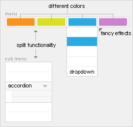
The Warp framework provides a powerful menu system to handle menu types with different templates and styles, letting you create any interface you have in mind. Learn more about setting up the menu by reading this tutorial.
Menu Types
In addition to our default menu rendering we provide two different menu types: the accordion and drop down menu. Both can be loaded by using the menu class suffix. For example, use "dropdown" or "accordion" as the menu class suffix to render the specific menu type.
Subtitles
Menu items can have subtitles to provide a more detailed explanation on what information a user will find. Just use the pipe character twice in your menu item name. For example, "My title || My Subtitle". Don't worry about the Joomla search. The pipe characters are removed in the Joomla search results. Read the tutorial.
JavaScript Effects
Most YOOtheme menus come with lots of fancy effects like smooth transitions and fading colors. Take a look at the JavaScript based menus provided by the Warp Framework to learn more.
Background Images
The menu item you set in the Joomla menu administration for each menu item will appear as the item's background image. It is also possible to load a different image for the same menu item, depending on the menu type. For example, if you have set an image "item1.jpg" for the sub menu and you need a larger image in the drop down menu, just place an image called "item1_dropdown.jpg" in the same folder. Learn more...
Page Color
A page color can be set individually for each menu item. That way, you can style every page linked to from a menu item independently. For example, use "itemcolor-black" as the page class suffix and the CSS class black will appear in the body tag of that page. video tutorial.
Drop Down Menu
Use "dropdown" as the menu class suffix and publish the menu in the "menu" position to load the drop down menu.
Multi columns
The number of columns in the drop down area can be set individually for each menu item to suit any of your needs. For example, use "columns-2" in the page class suffix and the drop down menu of this menu item will have two columns. This way you can define different drop down columns for each menu item.
Flexible drop down width
To keep CSS modification as simple as possible, we provide a template parameter for the column width of the drop down menu. You can set the column width in the template configuration.
JavaScript
Moves the drop down area out with a smooth transition. The drop down area also remains visible for some milliseconds when the mouse leaves it unintendedly. And of course, the menu keeps fully functional if JavaScript is disabled.
Drop Down Module Position
You can mix the drop down menu with any Joomla module by publishing it in the "menu" position. The login module, for example. The module will drop down and look like it is part of the menu.
Accordion Menu
Use "accordion" as the menu class suffix and publish the menu (for example, in the "left" or "right" position) to load the accordion menu.
A smooth accordion effect can be applied to the sub menu when using a menu item "separator". Closed/Opened state and two different sliding modes are supported. Learn more.


